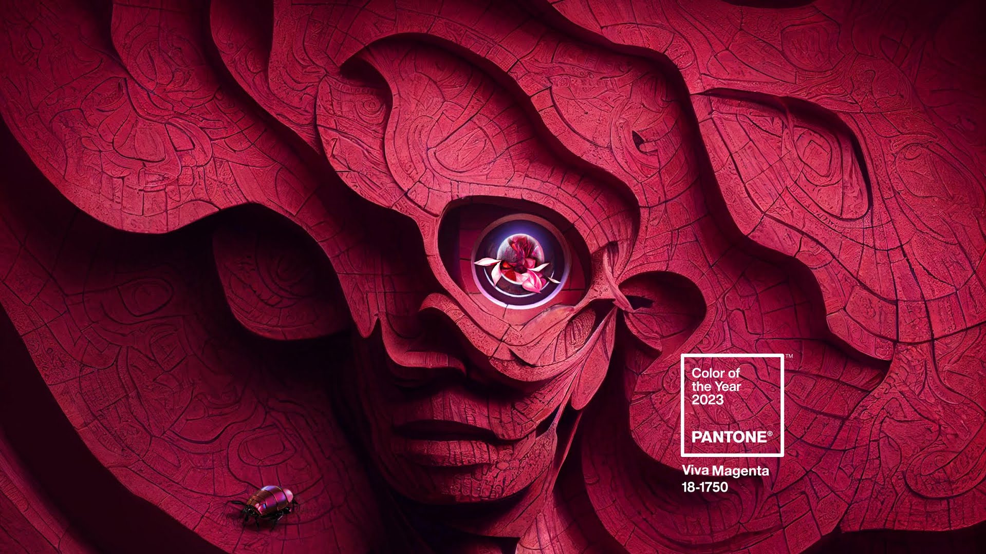
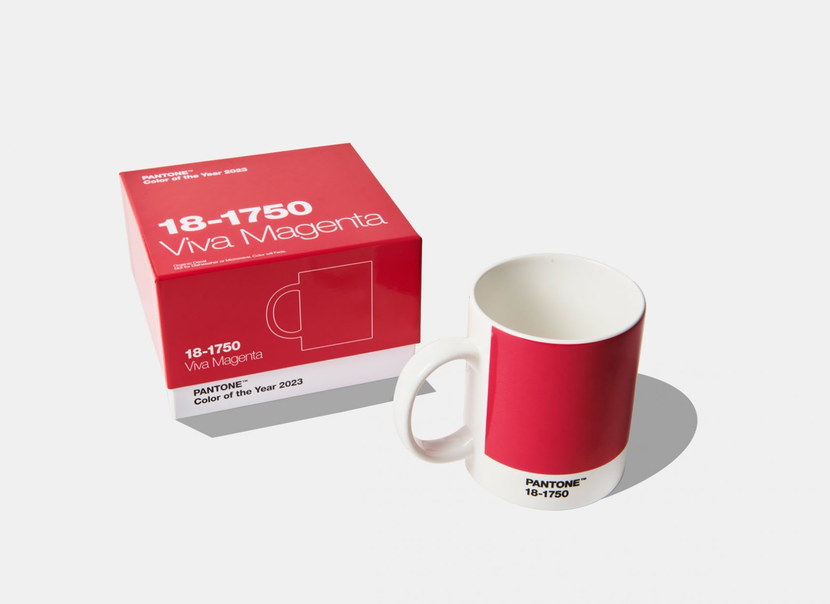
The Pantone Color Institute, a leading authority on color, has selected Viva Magenta 18-1750 as the color of the year for 2023. The decision is undoubtedly audacious, upbeat, and bright.
The ability of the Pantone Color Institute to identify, select, and create color challenges that are in line with brand aspirations has earned it widespread acclaim. The color red represents strength and power while also encouraging positivity, excitement, and zeal.
Read Also: BON Award: Organizers Rename Category In Honour Of Late Singer, Sammie Okposo
The tint was dubbed a “unconventional colour for an unconventional period” in a post published by Pantone on Instagram on December 2, 2022.
View this post on Instagram
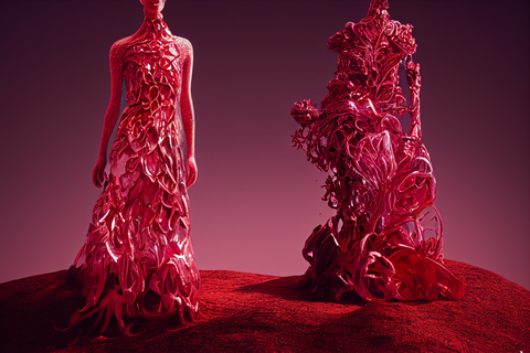
More about Pantone’s colour of the year: Viva Magenta
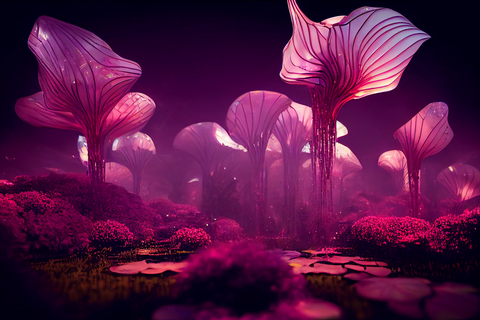
The brave and fearless descendant of the red family, Viva Magenta is certainly assertive and empowering but not aggressive. This is not the conventional red that strikes our mind when we think of the shades of crimson. A balanced shade, a pink of warm and cool tones, and the borderline between red, pink and blue is Viva Magenta.
Read Also: Pantone Unveils Its Color Of The Year 2020: Classic Blue
According to Leatrice Eiseman, the executive director of Pantone Color Institute,
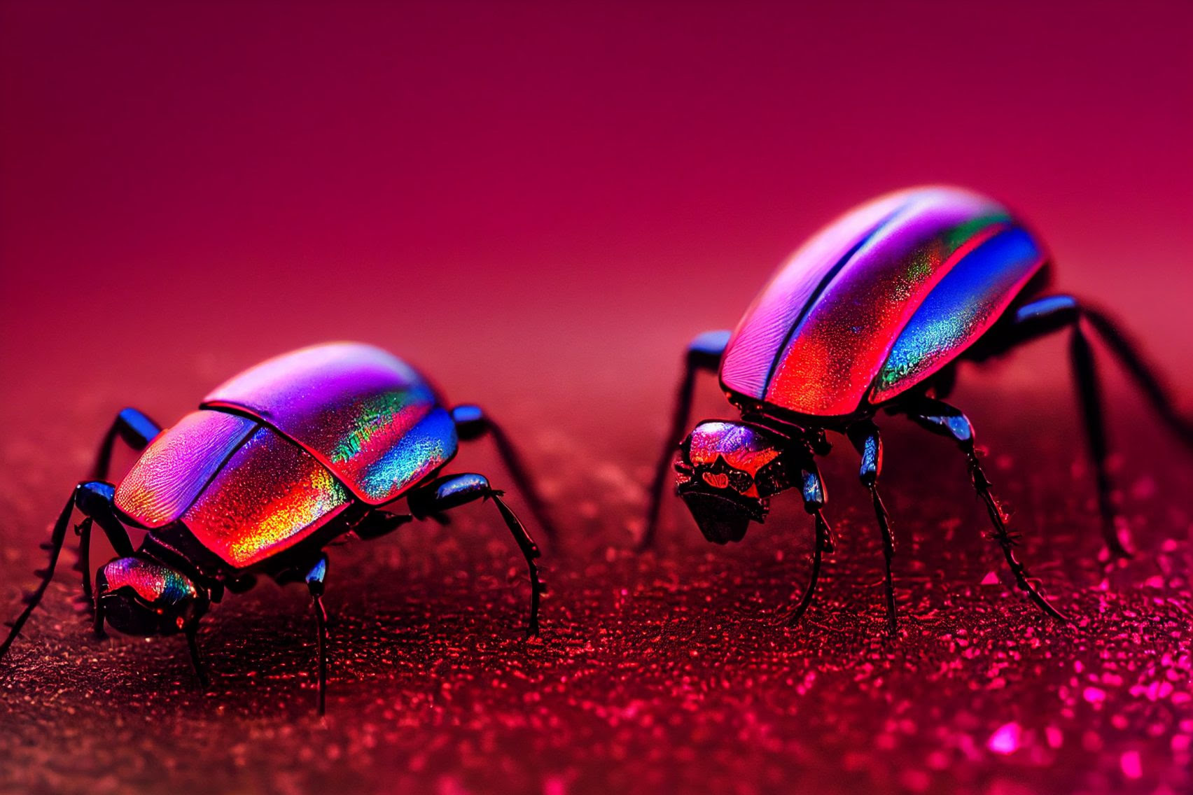
The hue is an “animated red, pulsating with movement.” For inspiration, the institute directly points toward mother nature. Cochineal dyes acquired from insects, the rich pink and magenta shades in fabrics and the shades of butterflies, all inspired them to create this brave and fearless Viva Magenta.
While selecting the annual colour, the institute also considered the challenges we faced in the past two years because of the COVID-19 pandemic. It felt it was time to choose a colour that inspires hope, strength, and dynamics. After the passionate blue shade Veri Peri of 2021, a very much technology-inspired colour, this is a fresh and brand-new approach towards an innovative idea.
Pantone’s official website quotes Eiseman as saying;
In this age of technology, we look to draw inspiration from nature and what is real. PANTONE 18-1750 Viva Magenta descends from the red family, and is inspired by the red of cochineal, one of the most precious dyes belonging to the natural dye family as well as one of the strongest and brightest the world has known.
Another Pantone Color Institute member and trend forecaster Jane Boddy said;
It’s a great colour for reflecting light, which gives it a sense of fantasy and glamour. It’s so flattering across all skin tones and all genders.
Traditionally you would imagine this (to) be a colour for the lips or the cheeks whereas now we’re seeing it as a solid eye colour in a painterly stroke.
This is not the first time Pantone has chosen a pink as its colour of the year. For 2016, the colour company chose a markedly lighter pastel pink with rose tones called Rose Quartz alongside Serenity, a calming light blue hue.
Last year, it named Very Peri, a purple colour described by Pantone as “a periwinkle shade of blue” as its colour of the year.
The controversy caused by the brand calling it blue was criticised by interiors expert Michelle Ogundehin, who called time on Pantone’s colour of the year exercise, writing in an article on Dezeen that “it’s time to reconsider the whole colour of the year carnival”.